
Home Contact
[Project]
Vectro Nexus - Personal Graphic Design Brand Identity
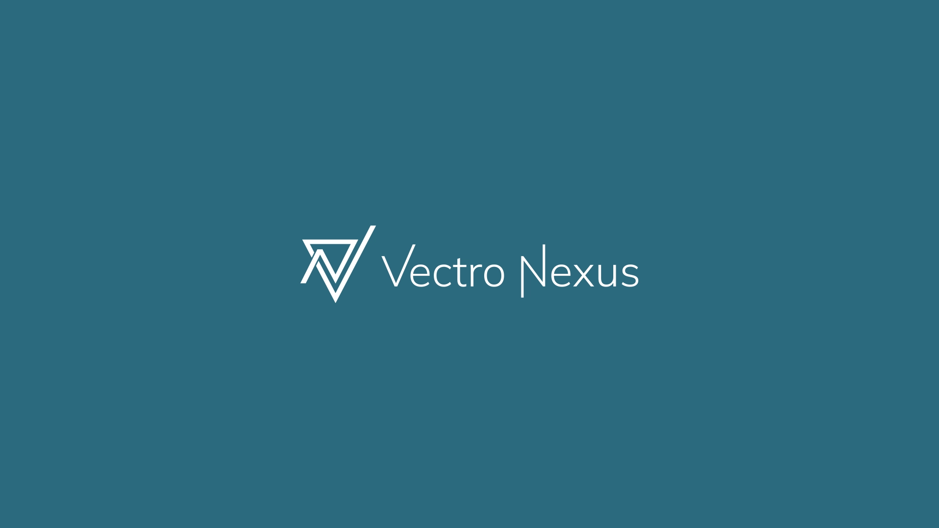
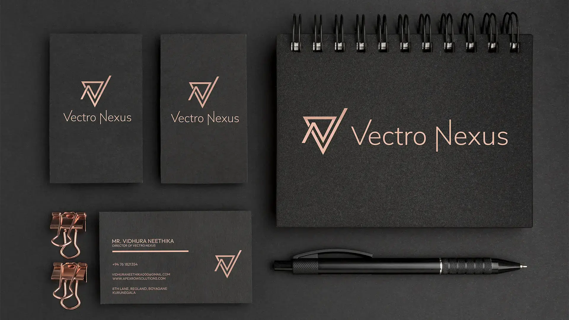
Vectro Nexus is a fully-developed personal brand identity crafted to represent my digital design persona in a professional, memorable, and modern way. This brand identity serves as the cornerstone for all my design-related communication, from social media branding to client presentations and portfolio branding. The logomark emphasizes geometry, precision, and digital craftsmanship qualities that align strongly with the vector based work I produce. Each line and angle in the design communicates intention, balance, and focus, resulting in a visual identity that feels futuristic, dynamic, and distinctly personal. The brand identity was created with adaptability in mind, ensuring the visual system can scale effortlessly across branding assets, website UI, email signatures, merchandise, and printing material.
Problem Statement
Goals & Objectives
My Role
Challenge and Solutions
Concept
Process of the Project
- 01
Conceptualization & Naming
The brand name 'Vectro Nexus' was chosen after exploring various naming patterns that related to digital design, modern aesthetics, and technical precision. 'Vectro' is derived from the word 'Vector', symbolizing scalability and crisp digital execution, while 'Nexus' represents the idea of connection and centrality. This naming process included researching semantic meaning, phonetic appeal, logo adaptability, memorability, and domain availability. The conceptual foundation was built around three core values: Innovation, Precision, and Modernity. - 02
Sketching & Geometrization
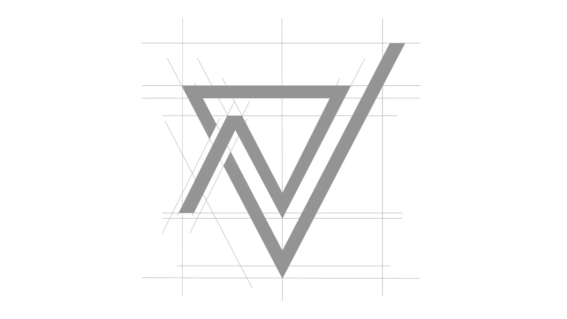
The early stage involved producing several rough sketches focused on merging the letters V and N. These ideas were iterated repeatedly to avoid cliches and overused shapes. Once a promising visual direction surfaced, I moved into Adobe Illustrator to construct a geometric grid system. Using grids ensured mathematical symmetry, accurate angles, consistent negative space, and scalable structure. The geometrization process refined the design into a clean, crisp form suitable for professional identity usage. This step also allowed experimentation with stroke widths, angle degrees, and shape proportions to achieve maximum balance. - 03
Digital Execution & Color Selection
The vectorization process was executed entirely in Adobe Illustrator, ensuring pixel-perfect geometry. The Deep Teal (#2c6a7f) color was selected for its psychological association with creativity, modernity, and trustworthiness, while the black (#040bod) provides strong contrast for bold presentations. The palette underwent multiple tests in dark mode, light mode, grayscale, and duotone settings to ensure consistency. I also explored gradient variants, but opted for a solid-color scheme to maintain timeless simplicity and maximum scalability. - 04
Typography Definition
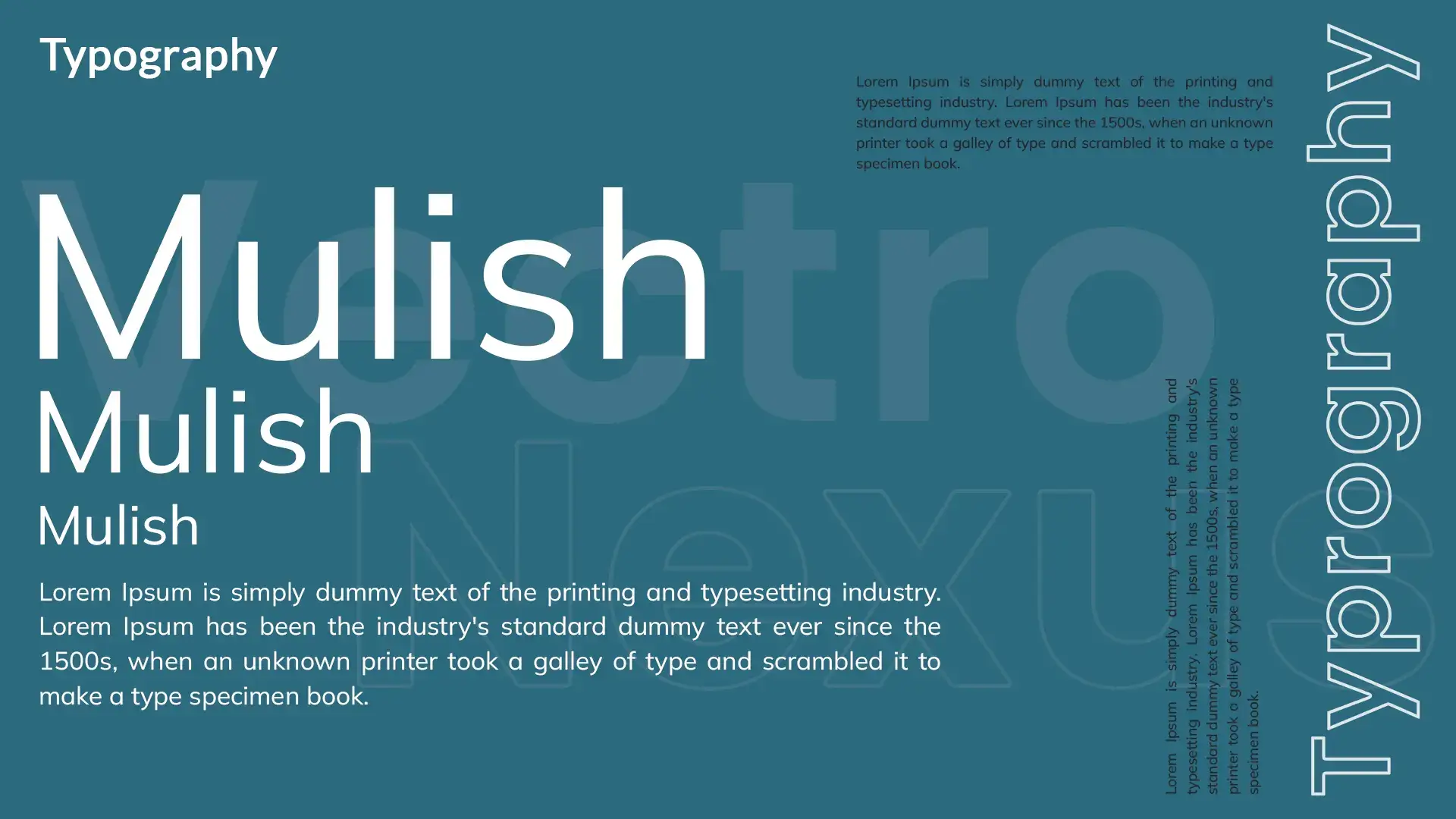
Mulish was chosen as the primary typeface due to its minimalistic curves, modern structure, and exceptional readability across both digital and print environments. The typeface pairs harmoniously with the geometric logomark by providing a clean, neutral wordmark that does not compete with the symbol. Typography guidelines were established, including heading weights, spacing ratios, kerning adjustments, and usage recommendations for sub-brands and future collateral. - 05
Mockup and Application
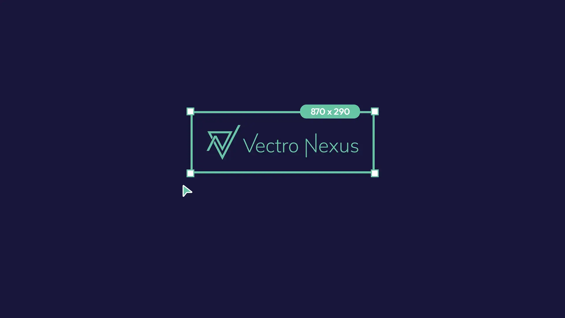
Once the visual identity system was complete, I created a series of mockups to demonstrate real-world application. These included stationery designs, business cards, signage, brand apparel, digital UI headers, profile pictures, and marketing posters. Each mockup was created in Adobe Photoshop using high-resolution templates. The focus during this stage was to test legibility, balance, and emotional impact across multiple contexts. The identity proved highly adaptable, maintaining clarity at small scale (favicons) and visual power at large scale (posters and banners).
#2c6a7f
#040bod
#FFFFFF
Key Features
Geometric Logomark (Integrates V and N)
Custom Wordmark Using Mulish Typeface
Modern & Minimalist Visual Identity
Scalable Vector Structure
Consistent Color System
Brand Lockup Variations
Favicon & Social Icon Suite
Typography and Spacing Guidelines
Real-World Mockup System
High Adaptability Across Media
Tools
Adobe Illustrator
Adobe Photoshop
Tags
#brand identity#logo design#branding#personal brand#freelance#geometric design#vector graphics#modern#typography#professional identity
Conclusion
Contact Me
Let's build something amazing together
Have an Idea? Let’s Make it Real
I'm currently available for freelance projects and open to full-time opportunities. If you have a project that needs some creative touch, or just want to say hi, feel free to drop a message.
Email Addressvidhuraneethika000@gmail.com
Phone Number+94 76 18 21 354
LocationKurunegala, Sri Lanka
Vidhura