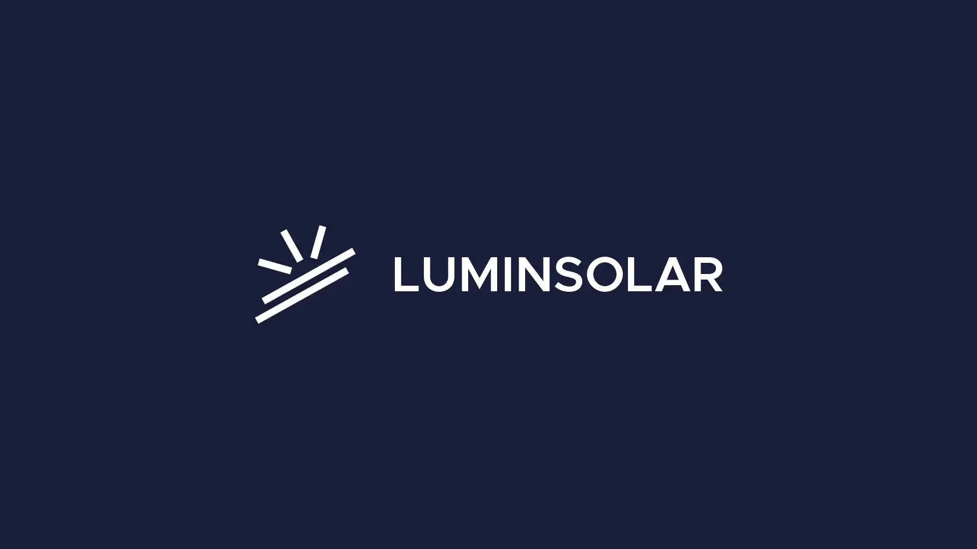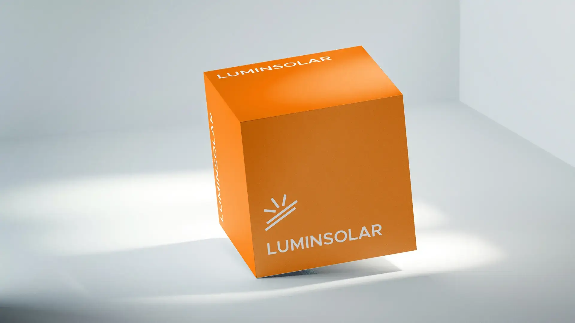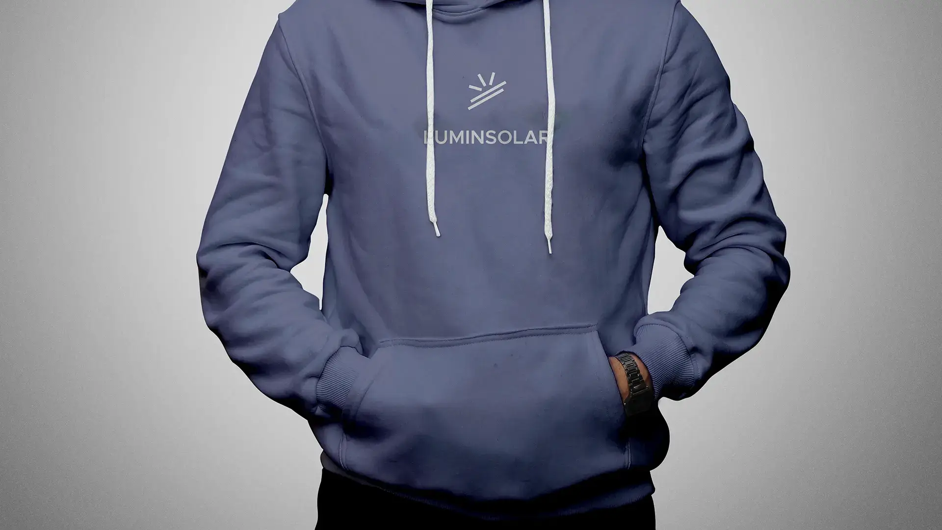
The LuminSolar logo is a minimalist yet powerful representation of solar energy, combining abstract sun rays with structured solar panels to symbolize the seamless transformation of sunlight into clean power. This modern and versatile design captures LuminSolar's commitment to renewable energy, technological advancement, and a brighter, eco-friendly future, establishing a strong visual identity for a forward-thinking solar brand.
Problem Statement
The solar energy market requires branding that conveys both high-tech efficiency and environmental sustainability. The challenge was to design a clean, modern logomark that abstractly communicates the process of solar power generation, harnessing radiant energy and converting it via structured panels, while ensuring maximum scalability and memorability across digital and physical applications.
Goals & Objectives
The primary goal was to create a timeless, trustworthy, and instantly recognizable logo for the solar industry. Key objectives included designing a geometrically precise mark using a grid system, selecting a strong, technical typeface, and establishing a color palette that clearly contrasts the energy source (Sun) and the company's reliability.
My Role
I served as the Brand Identity Designer, responsible for the complete creative direction, conceptualization, and execution of the LuminSolar logo and core visual identity. This included developing the symbolic mark, defining the typography, selecting the primary and accent colors, and creating application mockups.
Challenge and Solutions
The main challenge was simplifying the complex idea of solar energy conversion into a simple, three-stroke sun and two-stroke panel graphic. The solution involved using sharp, precise lines and a geometric construction grid to create a balanced, dynamic tilt, suggesting both optimism and efficient energy transfer. The use of a deep navy background (#1a1e39) with bright white and orange accents highlights the clean, high-contrast nature of the technology.
Concept
The LuminSolar logo is a bold and modern representation of solar energy, sustainability, and innovation. The design incorporates solar panels and sun rays, symbolizing the seamless conversion of sunlight into clean, renewable power.
Logo Breakdown and Symbolism
The bottom two horizontal lines represent solar panels absorbing sunlight, signifying stability, efficiency, and sustainability. Their diagonal tilt reflects optimization and directionality, like real-world solar installations. The top three lines represent the powerful and radiant energy of the sun. The uneven yet dynamic strokes showcase natural solar dispersion, movement, and energy flow. Collectively, they depict the complete process of solar energy harnessing.
Process of the Project
01
Conceptualization and Ideation
Focused on core brand values (Sustainability, Efficiency, Innovation). Developed sketches aimed at abstractly combining the shapes of the sun and solar panels.
02
Geometric Construction and Grid Work
The selected concept was moved into Adobe Illustrator and meticulously constructed using a geometric grid , ensuring precise angles and perfect symmetry for maximum visual stability and scalability.
03
Typography and Color Definition
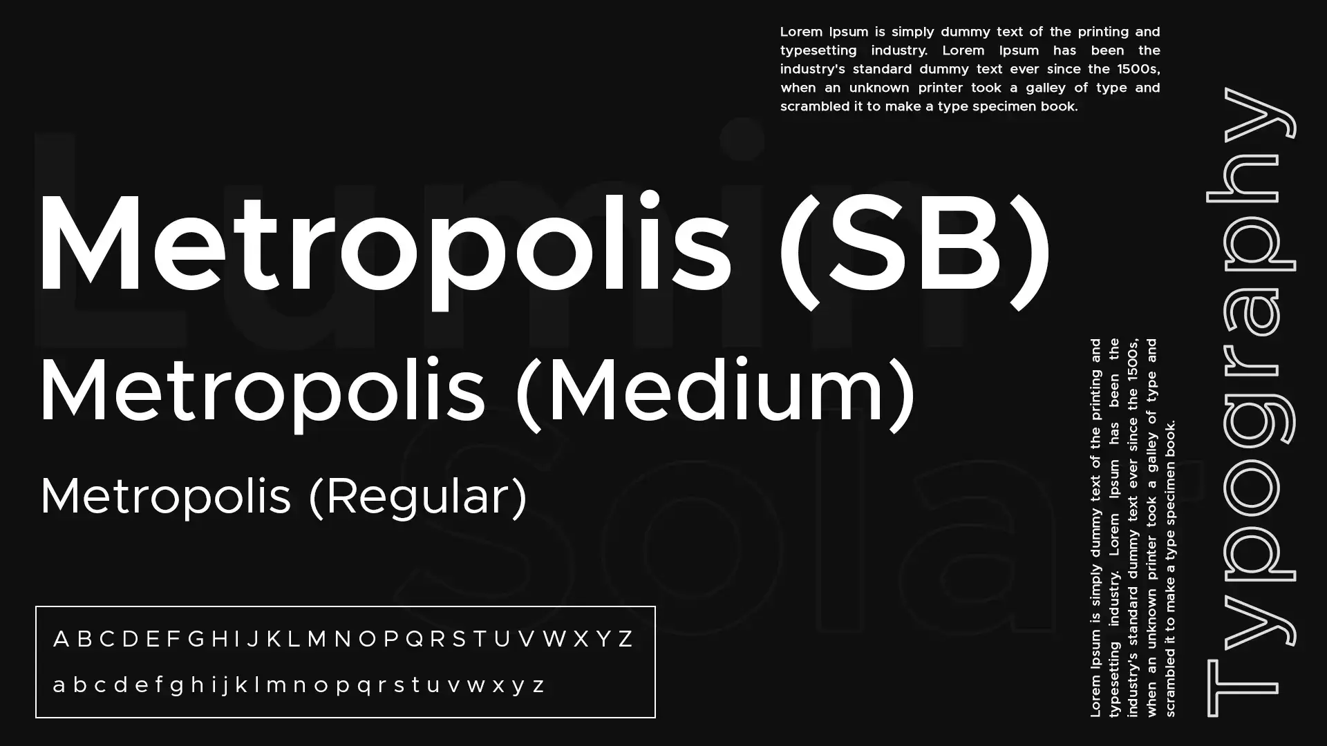
Selected Metropolis (SB, Medium, Regular) as the brand typeface for its clean, technical, and modern aesthetic. Defined the primary palette: Deep Navy (#1a1e39) for professionalism and a strong base, and Bright Orange/White for energy and luminescence.
04
Final Execution and Mockups
Finalized the primary logo lockup (mark + wordmark) and executed mockups in Adobe Photoshop to demonstrate application versatility on merchandise (like hoodies) and brand materials.
#1a1e39
#ff7a04
#FFFFFF
The visual tone of the narrative. These colors set the stage for every interaction, crafting an atmosphere that is both intuitive and immersive.
Key Features
Minimalist Geometric Logomark
Symbolism of Solar Energy Conversion
Metropolis Typeface
High Scalability
Modern Color Palette
Clear Logo Breakdown
Conclusion
The LuminSolar brand identity successfully establishes a strong, high-tech, and sustainable image. The minimalist logomark effectively communicates the brand's commitment to clean power and technological innovation, providing a scalable and memorable visual identity for the solar industry.
Tools
Adobe Illustrator
Adobe Photoshop
Tags
#brand identity#logo design#solar energy#minimalist#geometric design#sustainability#renewable energy
Conclusion
The LuminSolar brand identity successfully establishes a strong, high-tech, and sustainable image. The minimalist logomark effectively communicates the brand's commitment to clean power and technological innovation, providing a scalable and memorable visual identity for the solar industry.
I'm currently available for freelance projects and open to full-time opportunities. If you have a project that needs some creative touch, or just want to say hi, feel free to drop a message.
Email Addressvidhuraneethika000@gmail.com
Phone Number+94 76 18 21 354
LocationKurunegala, Sri Lanka
Let’s Make Ideas Happen
Let's create something new, unique, and meaningful. We can explore visual or conceptual approaches