
Home Contact
[Project]
Login Interface for Mobile Devices
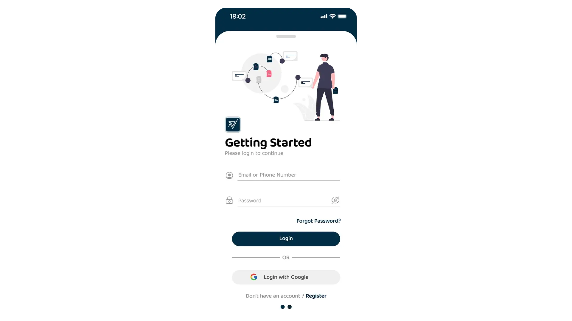
In today’s digital world, a user’s first impression of an app is often its login or onboarding screen. This project focuses on designing a login interface that is not only secure and functional but also visually welcoming and user-friendly. The goal was to create a clean, modern design that simplifies the login process and reduces user friction.
Challenge
Key Decisions
Solution
Process of the Project
- 01
Research & Inspiration
My design process began with a thorough analysis of leading mobile applications to understand current trends and best practices for login screens. I paid close attention to user feedback and common pain points, such as the frustration with multi-step forms and the confusion caused by unclear navigation. This research highlighted the need for a solution that was not only secure but also felt effortless and welcoming. I drew inspiration from minimalist design principles, focusing on clean lines, ample white space, and a clear visual hierarchy to create an interface that feels intuitive and modern. - 02
Wireframing & User Flow
I started by creating low-fidelity wireframes to quickly explore different layouts for the login screen. My primary goal was to simplify the user flow as much as possible. I focused on a single-page design to reduce friction and eliminate unnecessary steps. The user flow was mapped out to be clear and direct: from the initial "Getting Started" screen, users are guided to either log in using their email/password or a social account, or to register for a new account. This early-stage planning was critical in ensuring the final design would be easy to navigate. - 03
Prototyping
With the wireframes approved, I created a high-fidelity, interactive prototype in Figma. This allowed me to test the user experience and the feel of the UI. I focused on micro-interactions, such as the visual feedback when an input field is selected and the smooth transition upon login.
#012d45
#ffffff
Tools
Figma (UI/UX Design & Wireframes)
Adobe Photoshop (Mockups)
Tags
#uiux design#figma#mobile app ui#uiux#user interface#user experience#login page ui#mobile login#login ui
Conclusion
Contact Me
Let's build something amazing together
Have an Idea? Let’s Make it Real
I'm currently available for freelance projects and open to full-time opportunities. If you have a project that needs some creative touch, or just want to say hi, feel free to drop a message.
Email Addressvidhuraneethika000@gmail.com
Phone Number+94 76 18 21 354
LocationKurunegala, Sri Lanka
Vidhura