Hold on. Wait a minute.
Setting up your experience...
logo
[Project]

EvoTribe Fitness Center Brand Identity
ByVidhura Neethika
CategoryBrand
Full ProjectView
EvoTribe Fitness Center Brand Identity
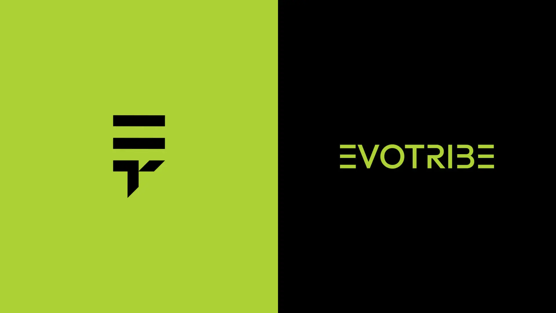
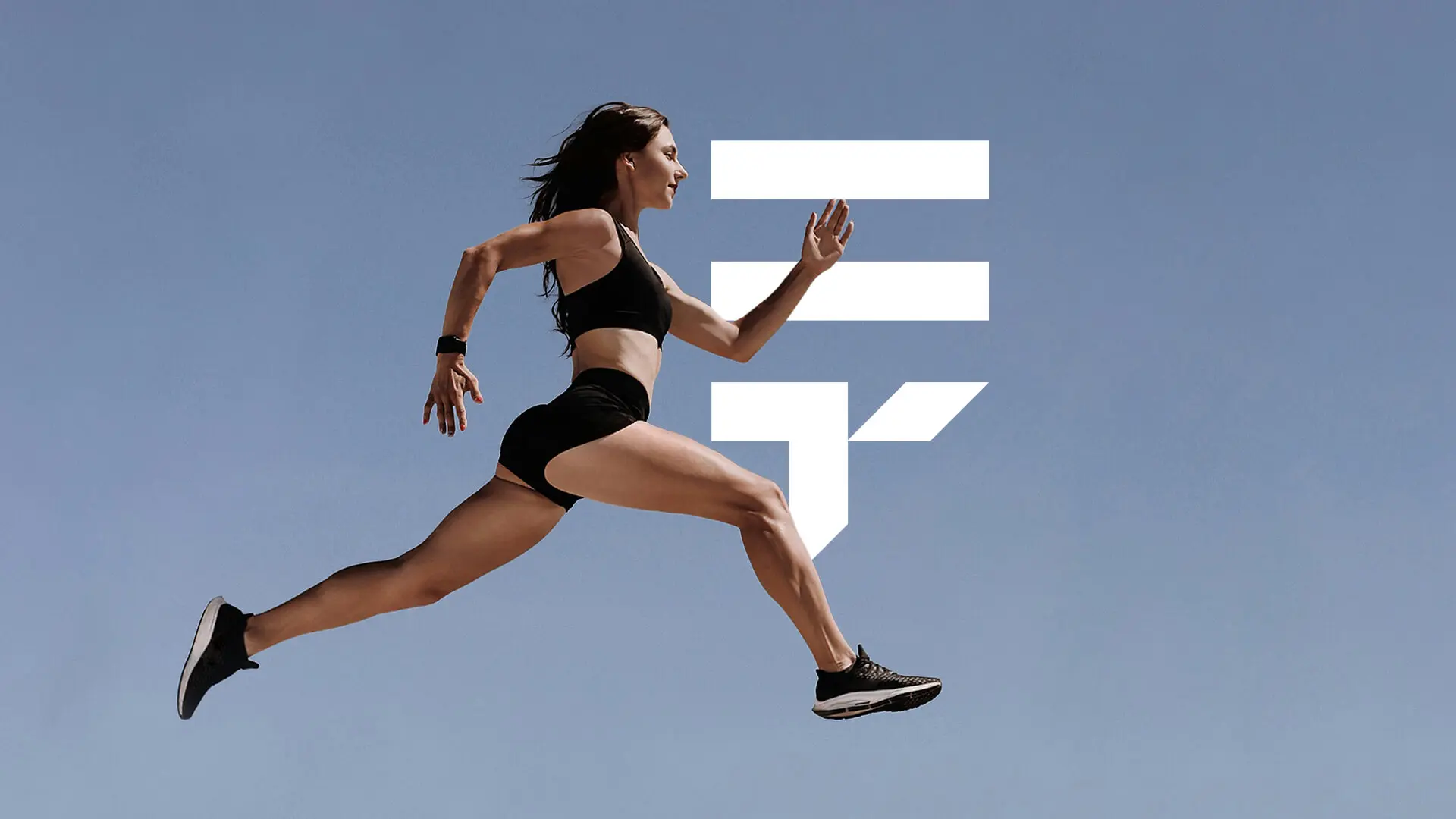
The EvoTribe Fitness Center logo is a bold and dynamic identity that reflects the core philosophy of evolution, growth, and community in fitness. It cleverly merges the initials 'E' and 'T' into a unified monogram symbol that embodies both strength and togetherness. The design suggests upward movement and progress, symbolizing personal achievement and continuous improvement, perfectly aligning with the brand’s core values of synergy between individual effort and collective support.

Problem Statement

The client required a distinctive logo for their fitness center that would appeal to a modern, active audience and convey a sense of community and forward motion. The challenge was to create a powerful monogram from the initials 'E' and 'T' that avoids cliches, feels energetic, and is highly effective on both digital platforms and physical merchandise like apparel and supplement packaging.

Goals & Objectives

The primary objective was to establish a strong, memorable, and athletic brand mark. Key goals included designing a versatile monogram that is geometrically precise, utilizing a vibrant and energetic color palette (lime green) to stand out, and ensuring the logo remains legible and impactful when applied to fitness supplements and clothing.

My Role

I served as the Brand Identity Designer, leading the conceptualization and execution of the EvoTribe monogram. My responsibilities included developing the initial symbolic merger of 'E' and 'T', applying geometric precision via a construction grid, defining the high-impact color scheme, and generating final application mockups for brand assets.

Challenge and Solutions

The main challenge was achieving a seamless and balanced merger of the two distinct letters ('E' and 'T') into a single, cohesive mark without sacrificing legibility. The solution was a modular, geometrically sharp design where the top horizontal bars form the 'E' through negative space and the lower section forms the angled 'T', creating a perception of upward force and stability.

Concept

The monogram design strategically combines the initials E (Evolution) and T (Tribe) to communicate the essential balance of personal evolution and collective strength. The angular lines represent determination and discipline, while the overall symmetry gives the logo a professional, modern, and high-performance athletic character.

Logo Breakdown and Symbolism

The horizontal bars at the top signify growth and progress, highlighting upward momentum in fitness journeys. The negative space between the bars subtly shapes the 'E,' while the bold vertical stroke transitions into the 'T.' This seamless combination of letters reflects unity, discipline, and the supportive spirit of the EvoTribe community. The sharp geometry symbolizes strength and precision, aligning with the energy and forward-thinking vision of the fitness center.

Process of the Project

  1. 01

    Conceptualization and Sketching

    Focused on concepts relating to momentum, modularity, and initials. Explored various ways to integrate 'E' and 'T' into a single, modern symbol, prioritizing geometric sharpness over fluid lines.
  2. 02

    Geometric Construction and Vectorization

    Developed the final design in Adobe Illustrator, using a detailed construction grid to ensure every line segment is balanced and proportionate, guaranteeing perfect scalability and crispness across all sizes.
  3. 03

    Color Palette Definition

    Defined a high-contrast, high-energy color palette: Lime Green (#acd137) as the signature brand color for energy, health, and vibrancy, paired with Black (#000000) for strength, power, and professionalism.
  4. 04

    Mockup and Application Testing

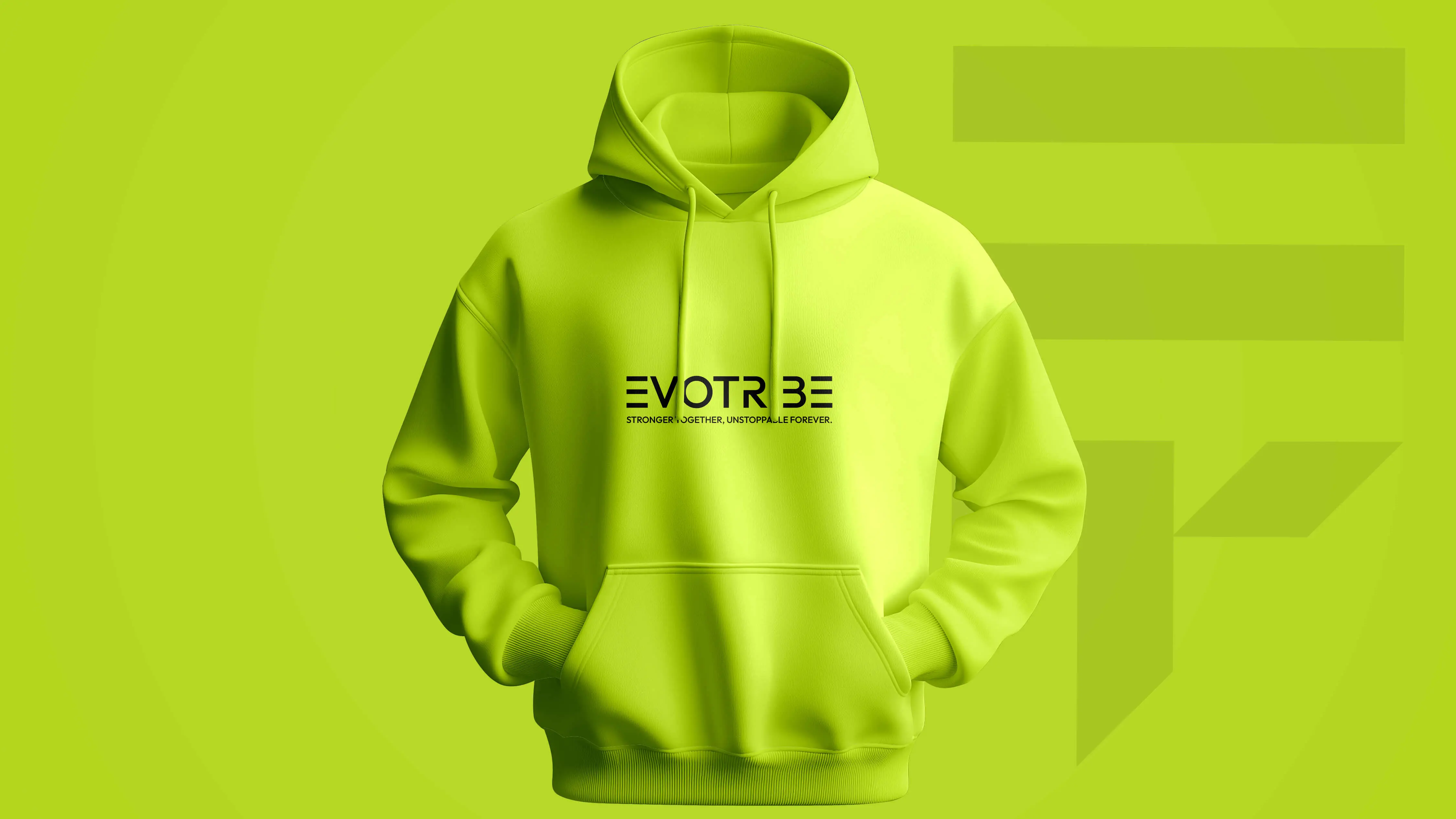
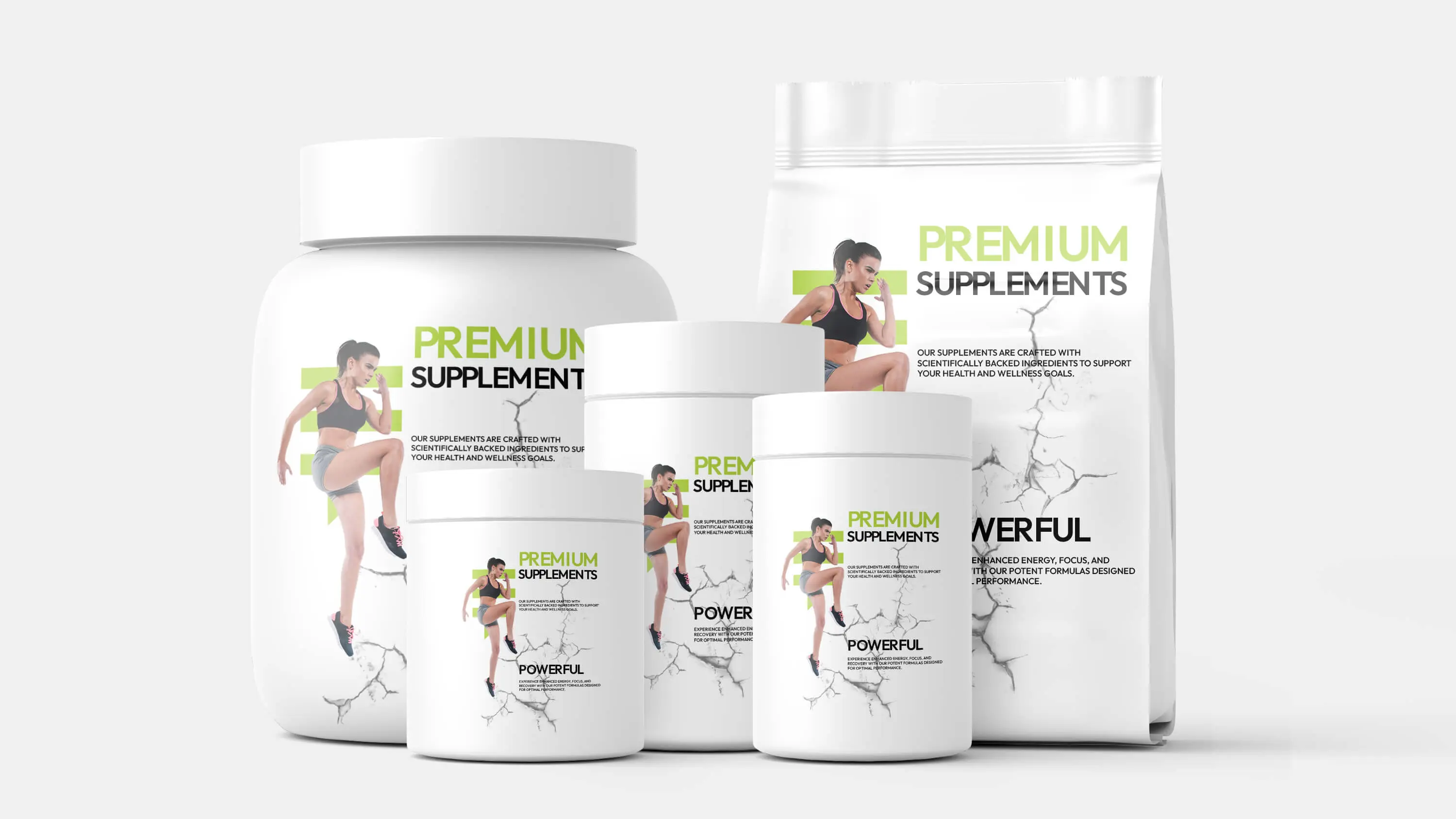
    Tested the logo's impact on various mockups using Adobe Photoshop, including fitness apparel (hoodies), supplement packaging, and digital interfaces, confirming its versatility and visual dominance.
EvoTribe Fitness Center Logo Grid
EvoTribe Fitness Center Logo Variations
EvoTribe Fitness Center Mockup
EvoTribe Fitness Center Branding Application
#acd137
#000000
#FFFFFF
The visual tone of the narrative. These colors set the stage for every interaction, crafting an atmosphere that is both intuitive and immersive.

Key Features

E/T Monogram Design
Bold, Geometric Style
High-Energy Color Palette
Applicable to Apparel and Product Packaging
Symbolizes Growth and Unity
Vector-based Scalability

Tools

Adobe Illustrator
Adobe Photoshop

Tags

#brand identity#logo design#fitness#monogram#geometric design#sports branding#modern

Conclusion

The EvoTribe Fitness Center logo successfully merges key brand concepts (Evolution and Tribe) into a dynamic, modern monogram. The powerful design and vibrant color palette ensure high visibility and strong recognition within the competitive fitness industry.
View full project

Contact Me

Let's build something amazing together

Have an Idea? Let’s Make it Real

I'm currently available for freelance projects and open to full-time opportunities. If you have a project that needs some creative touch, or just want to say hi, feel free to drop a message.

Email Addressvidhuraneethika000@gmail.com
Phone Number+94 76 18 21 354
LocationKurunegala, Sri Lanka
Vidhura